Sentry Software
Sentry Maven Skin 8.0.00
-
Home
- Writing Documentation
UI Components (Tabs, Accordion, etc.)
The skin includes Angular UI Bootstrap[1] components for interactive documentation, with a simple Markdown syntax.
Available Components
| Component | Description |
|---|---|
| Callouts | Notes, tips, warnings, and cautions |
| Tabs | Organize content in switchable tabs |
| Code Tabs | Show code examples in multiple languages |
| Accordion | Collapsible content panels |
| Collapse | Toggle content visibility |
| Carousel | Image slideshow |
Callouts
Callouts highlight important information using GitHub-style admonition syntax. They help draw attention to notes, tips, warnings, and other key content.
Syntax
Use a blockquote starting with [!TYPE] where TYPE is one of: NOTE, TIP, IMPORTANT, WARNING, or CAUTION.
> [!NOTE]
> Useful information that users should know, even when skimming content.

> [!TIP]
> Helpful advice for doing things better or more easily.

> [!IMPORTANT]
> Key information users need to know to achieve their goal.

> [!WARNING]
> Urgent info that needs immediate user attention to avoid problems.

> [!CAUTION]
> Advises about risks or negative outcomes of certain actions.
Live Demo
Useful information that users should know, even when skimming content.
Helpful advice for doing things better or more easily.
Key information users need to know to achieve their goal.
Urgent info that needs immediate user attention to avoid problems.
Advises about risks or negative outcomes of certain actions.
With Rich Content
Callouts support full Markdown formatting inside:
> [!TIP]
> You can include **bold**, *italic*, and `code` in callouts.
>
> - Lists work too
> - Multiple items
>
> And even [links](https://example.com) and code blocks:
>
> ```java
> System.out.println("Hello!");
> ```
You can include bold, italic, and code in callouts.
- Lists work too
- Multiple items
And even links[2] and code blocks:
System.out.println("Hello!");
Tabs
Tabs organize content into multiple panels, with one panel visible at a time.
Syntax
Use a blockquote with the [!TABS] marker and a bullet list:
> [!TABS]
> - First Tab
>
>   Content of the **first tab** with Markdown formatting.
>
> - Second Tab
>
>   Content of the *second tab*.
>
> - Third Tab
>
>   Content with `code` and [links](url).
How it works:
- Start a blockquote with
> [!TABS]followed by optional parameters - Use a bullet list (
-or*) for each tab - The first line of each list item becomes the tab heading (supports inline Markdown/HTML)
- Add a blank line, then the tab content with full Markdown support
Do not use Markdown headings (#, ##, ###, etc.) inside tab content. Headings define document sections in Doxia/Flexmark, so they can break out of the tab and appear outside the component.
If you need a visual heading inside a tab, use HTML text styling instead, for example:
<div class="h3">My heading inside a UI component</div>
Available options:
| Option | Description | Default |
|---|---|---|
active=varName |
AngularJS variable to track active tab | tabsActive1, tabsActive2, etc. |
justified=true |
Make tabs fill the entire width | false |
vertical=true |
Display tabs vertically | false |
Live Demo
Overview
This is the overview content created with the simple Markdown syntax. Tabs are great for organizing related information.
Installation
To install the skin:
- Add the skin dependency to your
site.xml - Add
maven-skin-toolsto yourpom.xml - Run
mvn site
Check the Quick Start[3] guide for details.
Configuration
Configure the skin in your site.xml file. See Configuration Reference[4] for all options.
Justified Tabs
Tab One
These tabs fill the entire width because justified=true is set.
Tab Two
The second tab content.
Vertical Tabs
Vertical Tab 1
Vertical tabs are great for side navigation.
Vertical Tab 2
More content in the second tab.
Code Tabs
A common use case for tabs in technical documentation is showing the same code example in multiple programming languages. Combine tabs with fenced code blocks:
> [!TABS]
> - Java
>
>   ```java
>   public class HelloWorld {
>       public static void main(String[] args) {
>           System.out.println("Hello, World!");
>       }
>   }
>   ```
>
> - Python
>
>   ```python
>   def main():
>       print("Hello, World!")
>
>   if __name__ == "__main__":
>       main()
>   ```
>
> - JavaScript
>
>   ```javascript
>   function main() {
>     console.log("Hello, World!");
>   }
>
>   main();
>   ```
Live Demo:
Java
public class HelloWorld {
    public static void main(String[] args) {
        System.out.println("Hello, World!");
    }
}
Python
def main():
    print("Hello, World!")

if __name__ == "__main__":
    main()
JavaScript
function main() {
  console.log("Hello, World!");
}

main();
Code tabs are perfect for API documentation, SDK examples, and tutorials where users may work with different programming languages.
Accordion
Accordions display collapsible content panels for presenting information in limited space.
Syntax
Use a blockquote with the [!ACCORDION] marker and a bullet list:
> [!ACCORDION]
> - First Panel Title
>
>   Content of the **first panel** with Markdown formatting.
>
> - Second Panel Title
>
>   Content of the *second panel*.
>
> - Third Panel Title
>
>   Content with `code` and [links](url).
How it works:
- Start a blockquote with
> [!ACCORDION]followed by optional parameters - Use a bullet list (
-or*) for each panel - The first line of each list item becomes the panel heading; inline Markdown/HTML formatting in this line is preserved
- Add a blank line, then the panel body content with full Markdown support
Do not use Markdown headings (#, ##, ###, etc.) inside accordion panel content. In Doxia/Flexmark, headings create document sections and may escape the accordion block.
Use a heading-like HTML element instead:
<div class="h3">My heading inside a UI component</div>
Available options:
| Option | Description | Default |
|---|---|---|
is-open=N |
Index of the panel to open by default (0-based) | 0 (first panel) |
close-others=false |
Allow multiple panels open simultaneously | true |
Live Demo
Sentry Maven Skin is a modern, responsive skin for Maven-generated documentation sites. It provides:
- Professional look and feel
- Full-text search
- Dark and light themes
- Mobile-friendly design
Add the skin dependency to your site.xml, add maven-skin-tools to your pom.xml, then run mvn site. See the Quick Start[3] for details.
Yes! Sentry Maven Skin is open source and licensed under the Apache License 2.0[5].
With Options
> [!ACCORDION close-others=false, is-open=1]
> - Panel One
>
>   This accordion allows multiple panels open at once.
>
> - Panel Two (Open by Default)
>
>   This panel is open by default because `is-open=1`.
Collapse (Collapsible Sections)
Hide and show content with smooth animation. This is perfect for optional details, FAQ sections, or reducing page clutter.
Syntax
Use a blockquote with the [!COLLAPSIBLE] marker, followed by the title on the next line:
> [!COLLAPSIBLE]
> Click to expand this section
>
> This content will be **hidden by default** and can be revealed
> by clicking the title. You can use all Markdown formatting:
>
> - Lists work perfectly
> - Including **bold** and *italic* text
> - And [links](https://example.com) too
>
> Even code blocks are supported.
How it works:
- Start a blockquote with
> [!COLLAPSIBLE](no additional parameters are currently supported) - Put the title on the next line of the same blockquote
- Add a blank line (
>alone) to separate the title from the content - All following paragraphs in the blockquote become the collapsible content
- Standard Markdown formatting is fully supported inside
Do not use Markdown headings (#, ##, ###, etc.) inside collapsible content. Because headings define sections for Doxia/Flexmark, they can break out of the collapsible block.
Prefer this alternative when you need a section title inside:
<div class="h3">My heading inside a UI component</div>
Live Demo
Sentry Maven Skin is a modern, responsive skin for Maven-generated documentation sites. It provides:
- Professional look and feel
- Full-text search
- Dark and light themes
- Mobile-friendly design
See the Quick Start[3] guide to get started!
Add the skin dependency to your site.xml, add maven-skin-tools to your pom.xml, then run mvn site. It's that simple!
Carousel
Cycle through images like a slideshow. Perfect for screenshots, galleries, or step-by-step visual guides.
Syntax
Use a blockquote with the [!CAROUSEL] marker and a list of images:
> [!CAROUSEL]
> * 
> * 
> * 
How it works:
- Start a blockquote with
> [!CAROUSEL]followed by optional parameters - Use a bullet list (
-or*) for each slide - Each list item contains an image using standard Markdown syntax:
 - The alt text becomes both the image description and the carousel caption
Available options:
| Option | Description | Default |
|---|---|---|
active=varName |
AngularJS variable to track active slide | carouselActive1, carouselActive2, etc. |
interval=5000 |
Time in milliseconds between slides | 5000 (Angular UI Bootstrap default) |
no-wrap=true |
Disable continuous cycling | false |
no-pause=true |
Disable pausing on hover | false |
Live Demo

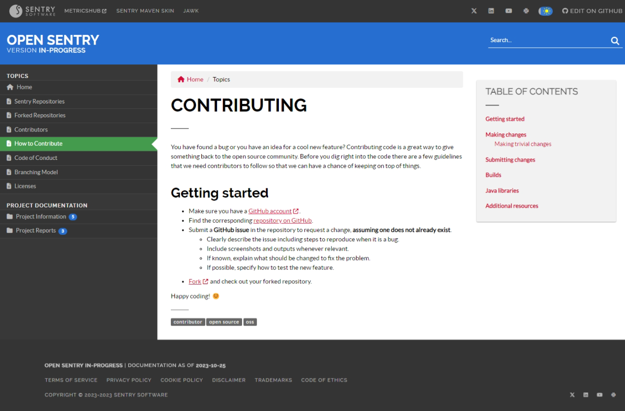
Desktop View: Clean, professional layout

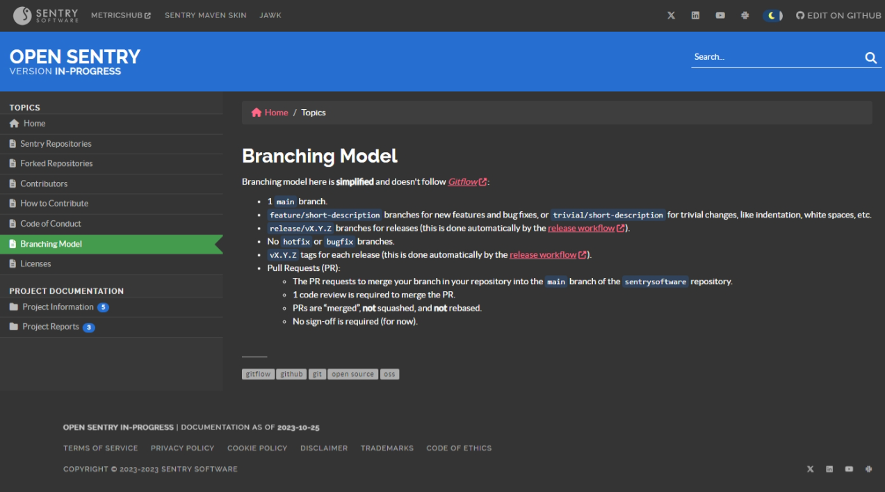
Dark Mode: Automatic theme detection

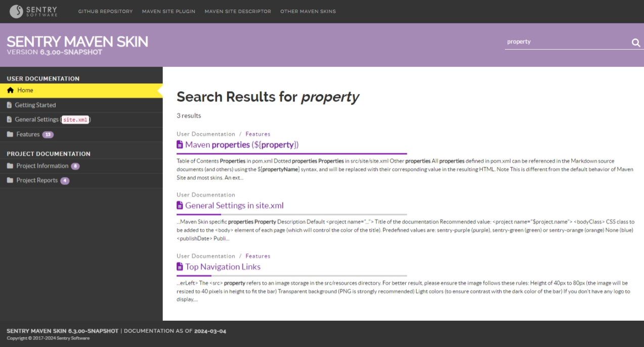
Built-in Search: No external services needed
With Options
> [!CAROUSEL interval=3000, no-wrap=true]
> * 
> * 
Best Practices
- Keep it simple: Use components to enhance readability, not add complexity
- Use meaningful headings: Panel and tab titles should clearly describe content
- Accessibility: Ensure interactive elements are keyboard-accessible
- Mobile-friendly: Test components on smaller screens
More Information
See the Angular UI Bootstrap documentation[1] for advanced HTML syntax and additional options.
See Also
- Page Structure[6] - How to organize page content
- Code Highlighting[7] - Code formatting and syntax highlighting
- Configuration Reference[4] - All site.xml and front matter options
- [1] https://angular-ui.github.io/bootstrap/
- [2] https://example.com
- [3] start.html
- [4] settings.html
- [5] https://www.apache.org/licenses/LICENSE-2.0
- [6] page-structure.html
- [7] code.html
